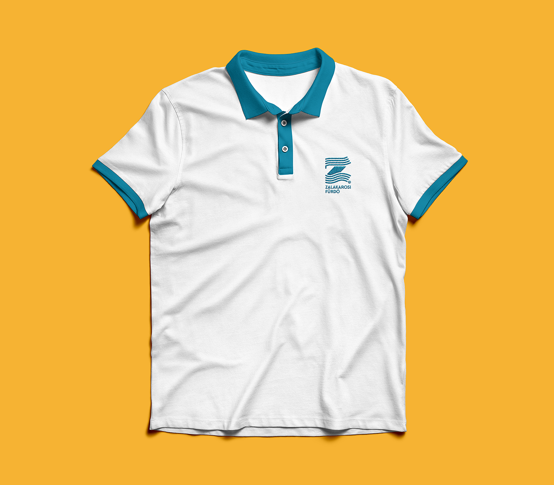
“Z” like
Zalakaros


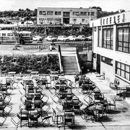
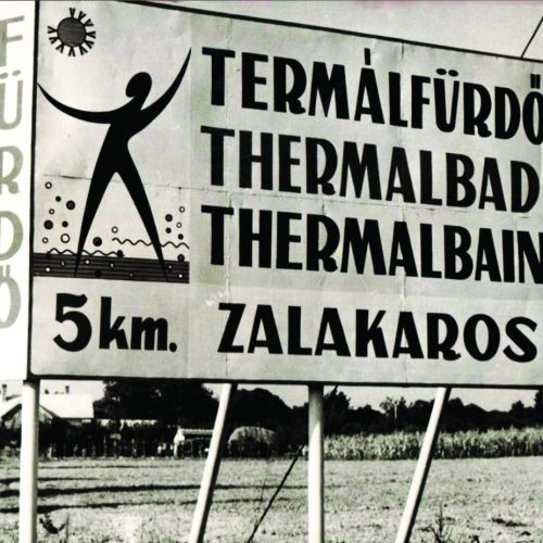
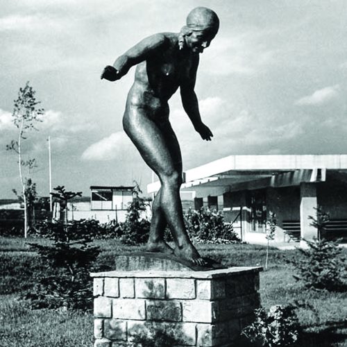
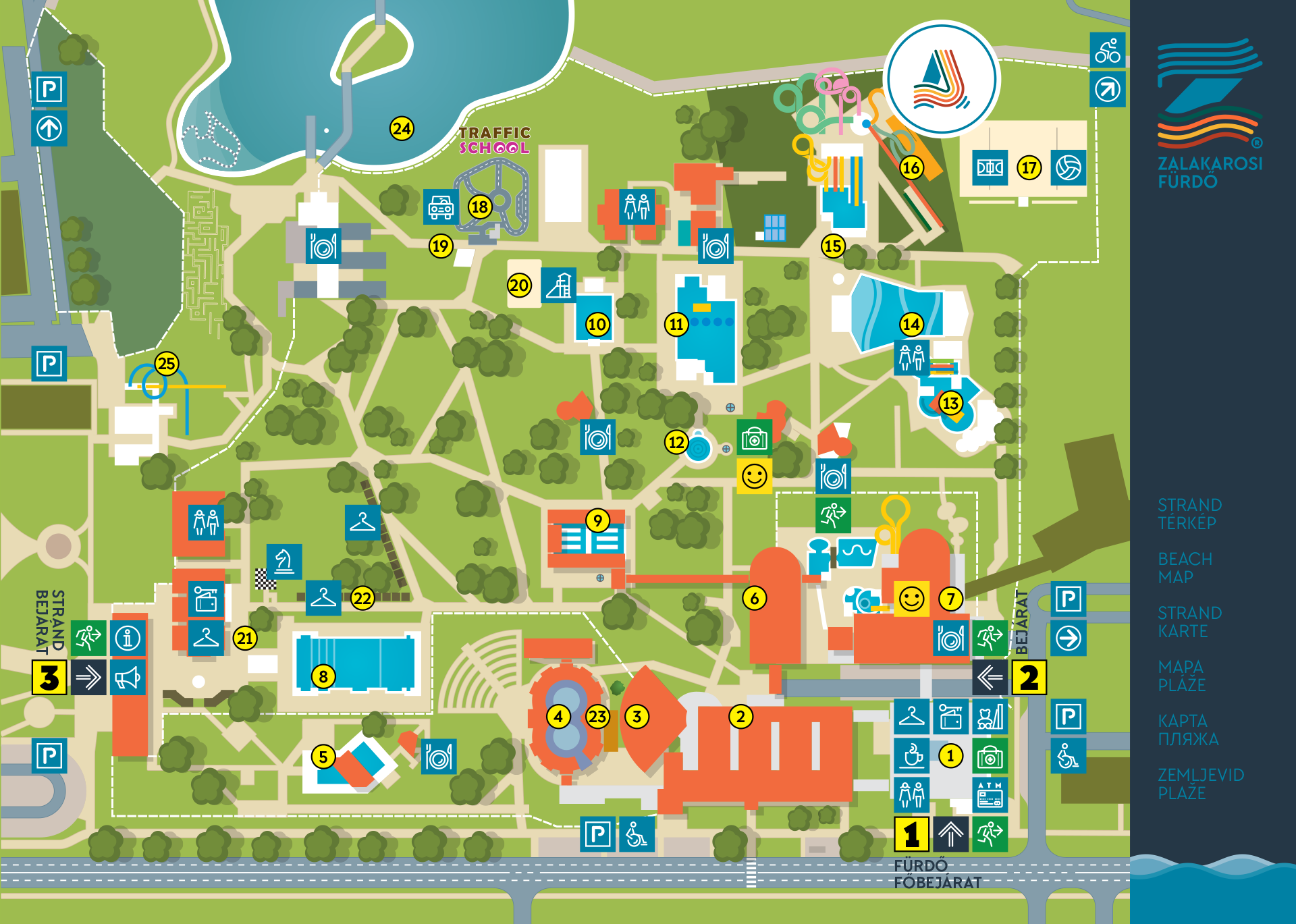
I was commissioned to design a standard brand strategy system for one of the best-known Hungarian spas, the Zalakaros Spa. This spa complex is over 30,000 square meters. You can find there indoor spa and outdoor spa opportunities as well. Over the last 50 years various services have been created, because the prime mission of Zalakaros is all members of the family can find the bathing experience here. That’s why it can be said that Zalakaros is a really family bath.


Therefore the new slogan is: We are a family (Egy család vagyunk in Hungarian) My first aim was to find the connection between the different ages and between variety of services which this monumental complex provides. The connection is important, but must separate the thematic features at the same time for sucessful communication, as:
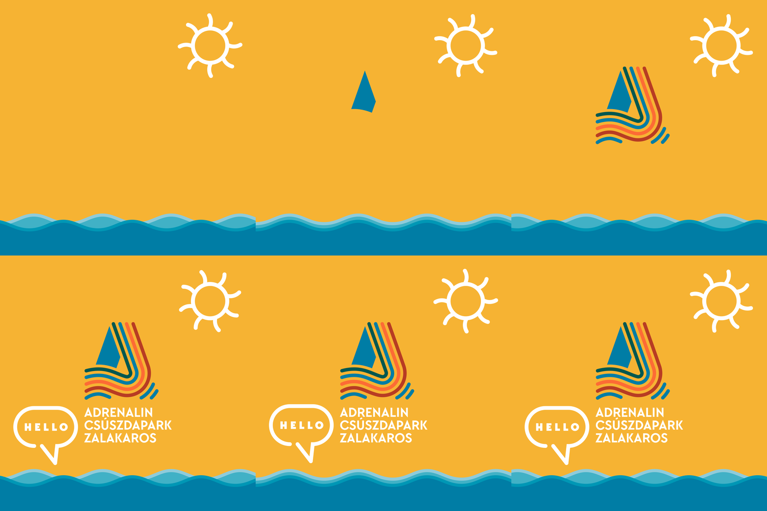
for facilities
– kid’s bath
– adventure pools and wellness services
– spa
– beach


in view of attractions and opportunities
– aquapark
– saunas
– hotel
– senior club
– shop


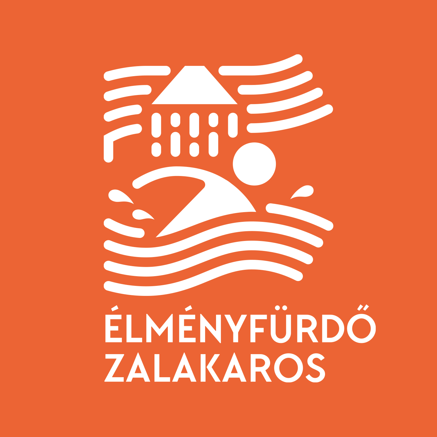
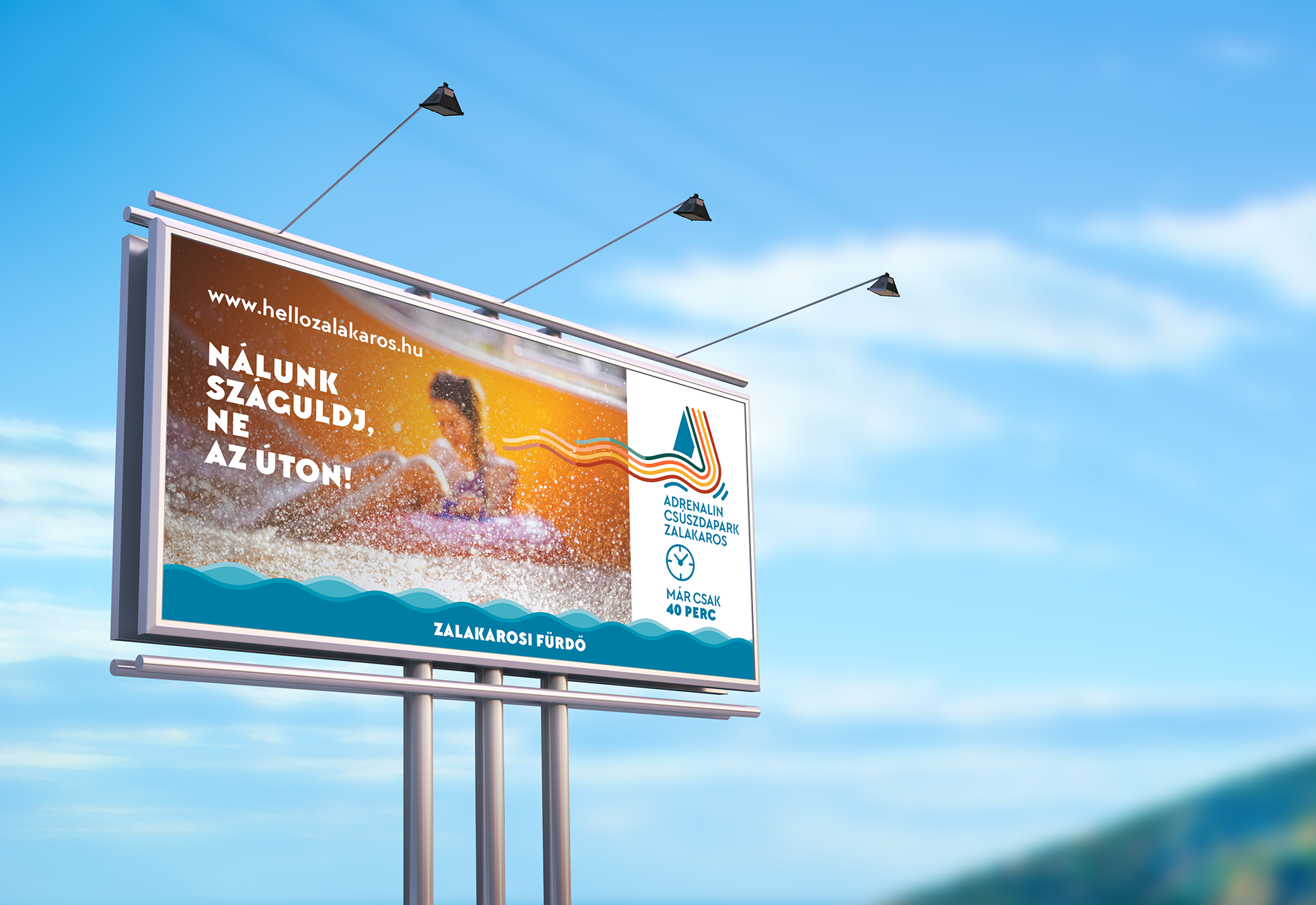
After having spent a lot of time there I found the waves as a functional connection element and symbol which I set up a visual system. The symbolism of the waves:

– creates connection between the past and the present
– creates connection between people of different ages
– playful and makes a good rhythm.
– communicates well the water attractions
– thematically adapts to a wide range of facilities offered by the spa.


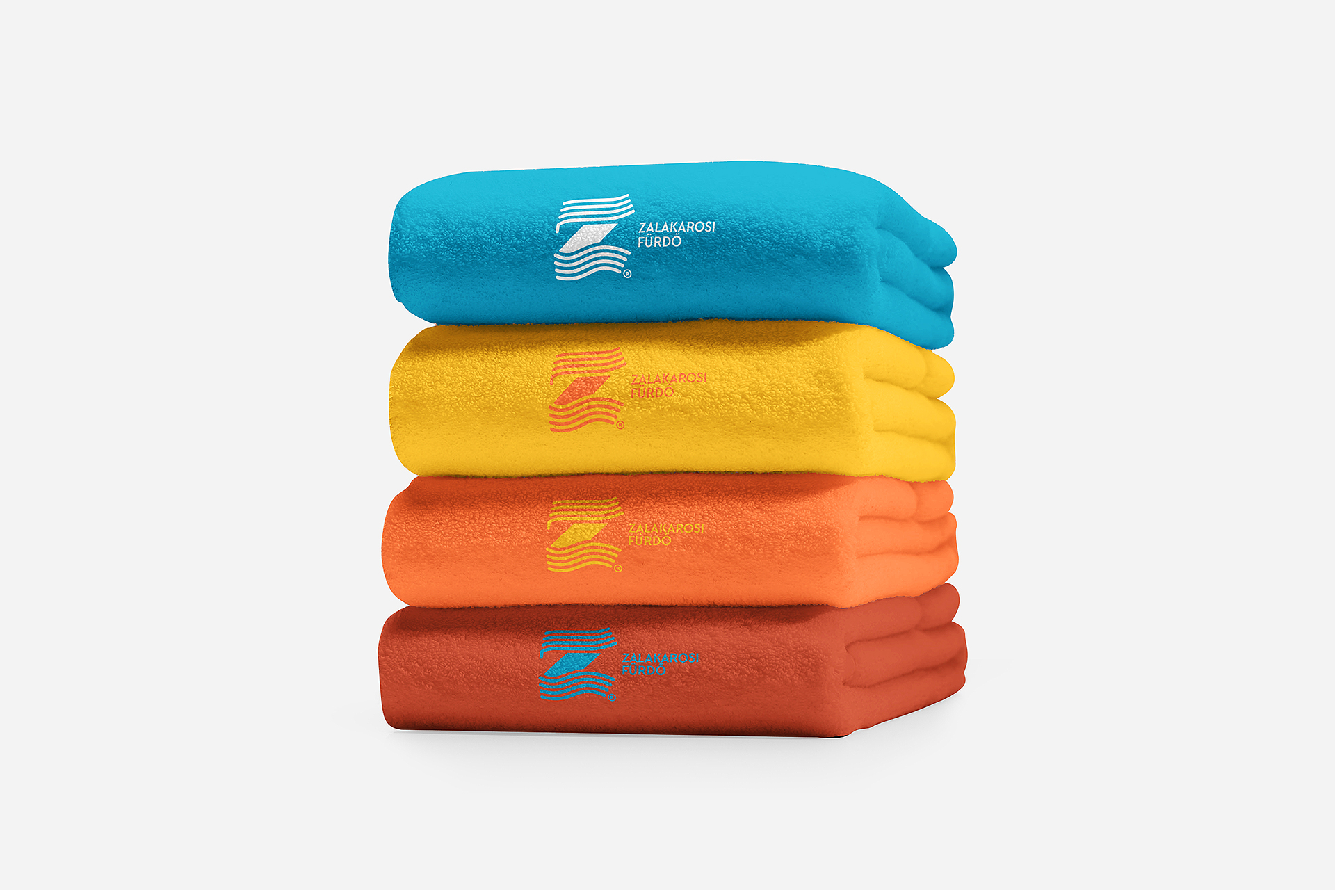
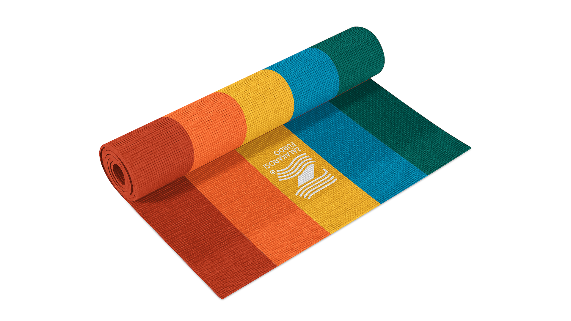
The colors are the decisive elements of the identity. They harmonize with the colors of the tiles and during the design work they also received thematic and functional meaning to help brand building and easy understandly visual communication.
By the logo system I used the shapes of initial letters and combined with the waves thereby I made connections between the elements of identity.